Nickl Pass
Mobile App
Problem
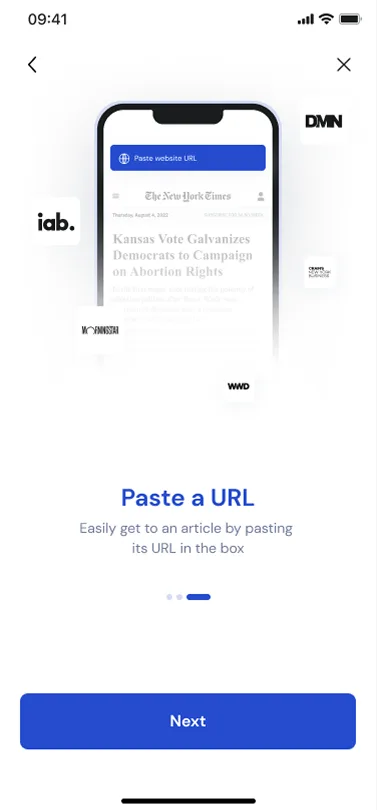
Managing digital passes during live sales or access moments is often slow and unintuitive. Existing solutions introduce friction through cluttered layouts, unclear hierarchy, and too many steps at critical moments.NicklPass needed an experience that feels instant, reliable, and effortless.
The Goal
- Enable fast access to digital passes
- Reduce cognitive load during key interactions
- Create a clean, scalable interface system
- Design with mobile-first constraints in mind
Design Principles
- Speed over complexity
- Clarity over decoration
- Consistency over novelty
- Mobile-first by default
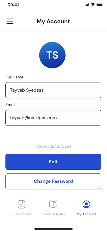
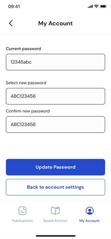
UX & Interface Design
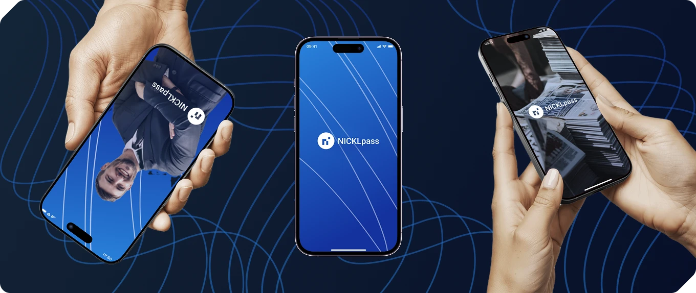
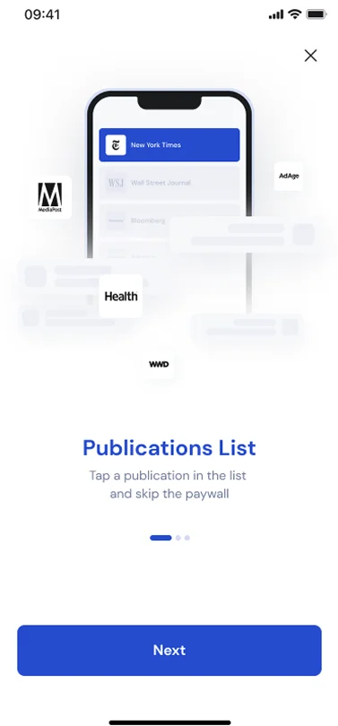
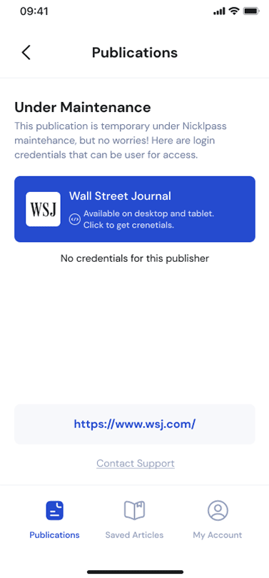
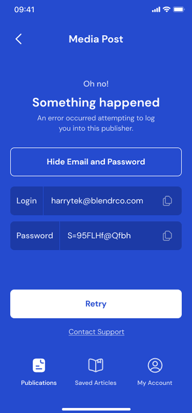
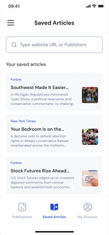
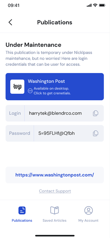
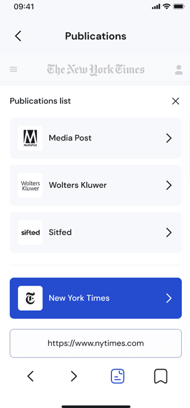
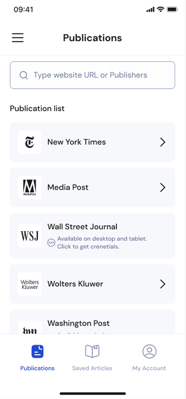
The experience is built around a card-based layout, making passes easy to recognize and access at a glance.
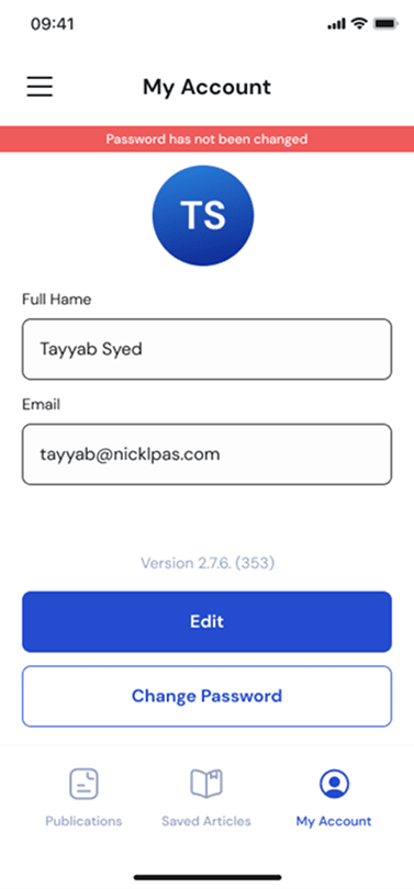
- A focused dashboard highlighting primary actions
- Strong typographic hierarchy for instant readability
- Clear spacing and touch-friendly targets
- Subtle color usage to indicate state and priority
The UI balances professional credibility with a modern, lightweight feel.
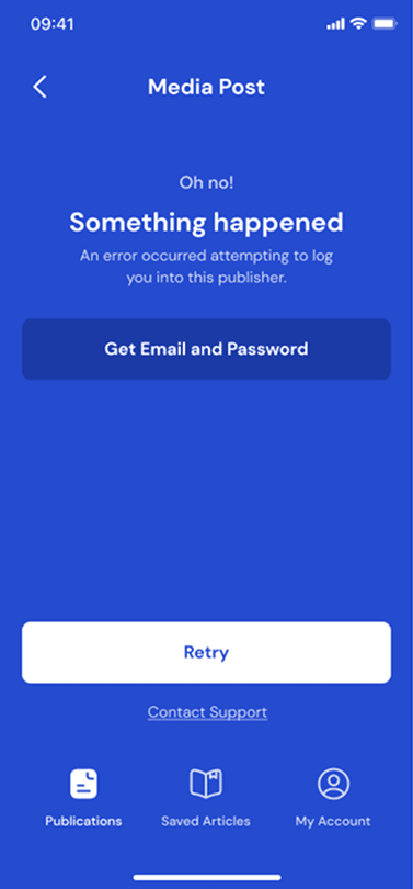
Challenges & Solutions
Keeping the interface scalable
As pass volume grows, the UI remains manageable through grouping, hierarchy, and progressive disclosure.
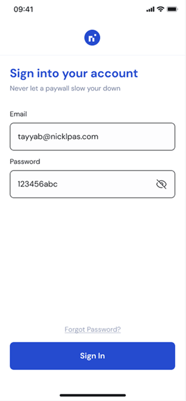
Designing for fast environments
Layouts were optimized for quick recognition, minimal taps, and one-hand use.
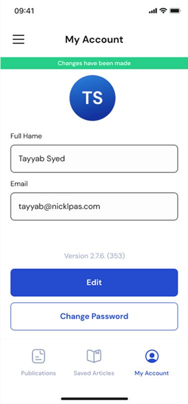
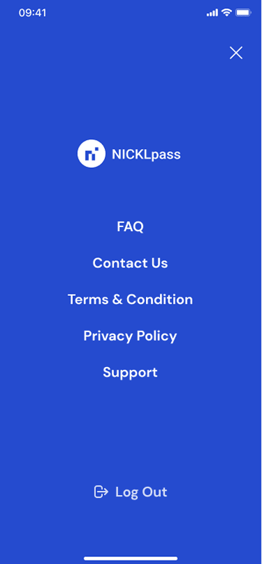
Mobile Screens


Outcome
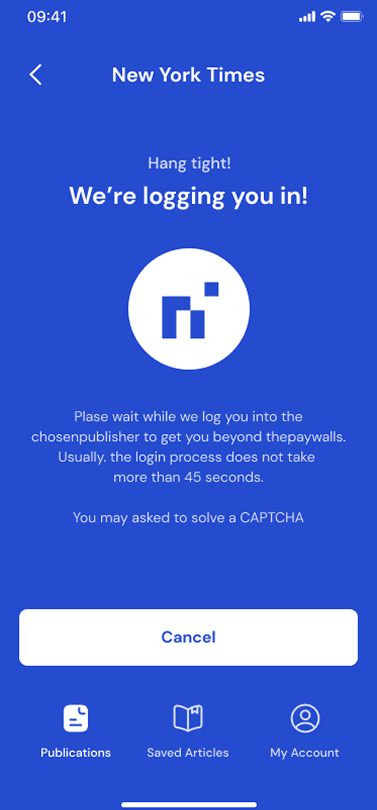
The final design delivers faster access to key actions, allowing users to complete tasks with minimal effort. It reduces friction during pass presentation by streamlining interactions and improving clarity at critical moments. In addition, it provides a scalable UI foundation for future features, ensuring the product can evolve smoothly over time.
NicklPass demonstrates my approach to UX/UI design: simplifying complex workflows, designing with real-world usage in mind, and building interfaces that feel intuitive from the first interaction.